City of Nanaimo Website Redesign
TIMEFRAME: October - November 2016 (10 weeks)
ITEMS PRODUCED: Wireframes, Interactive PDF’s
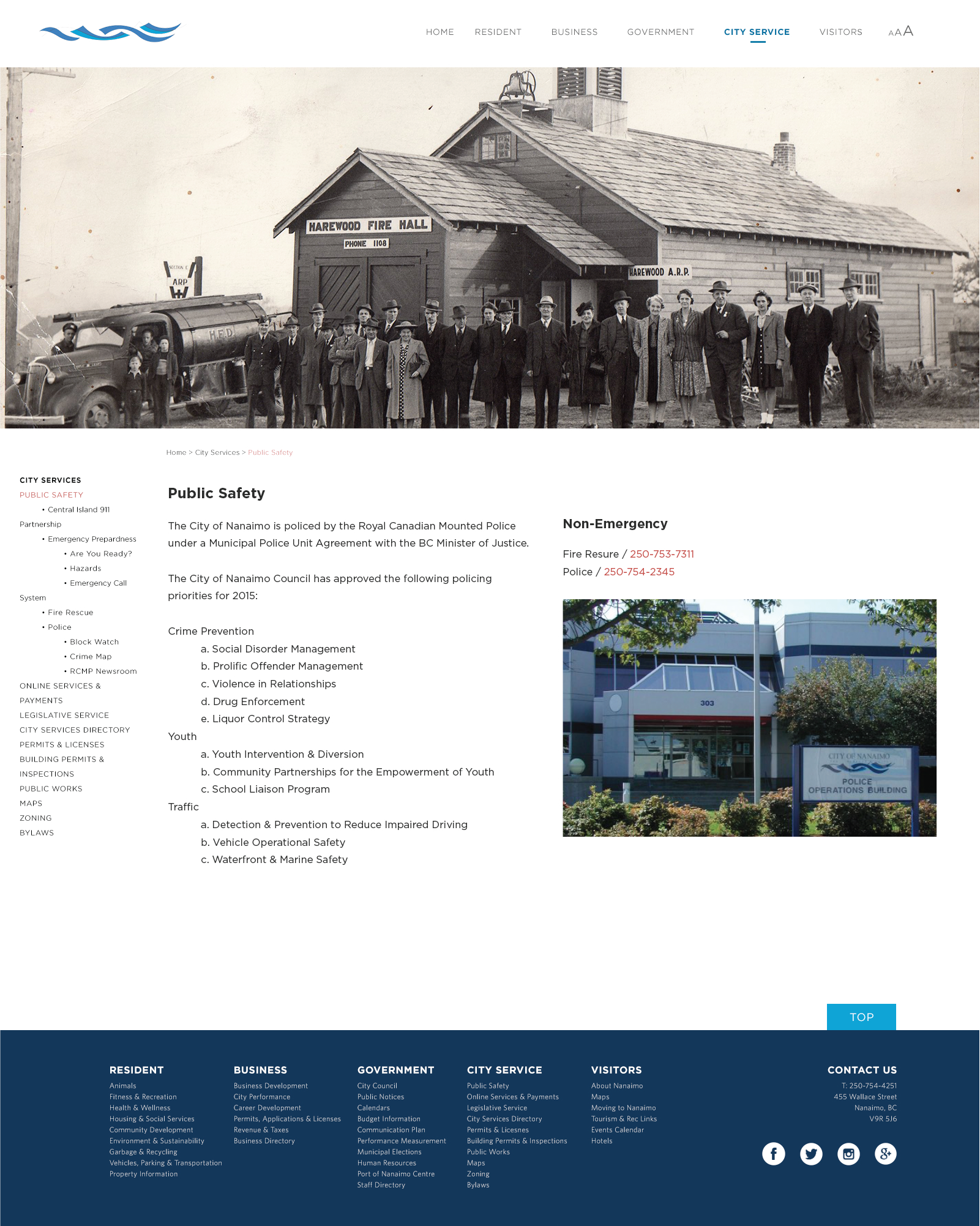
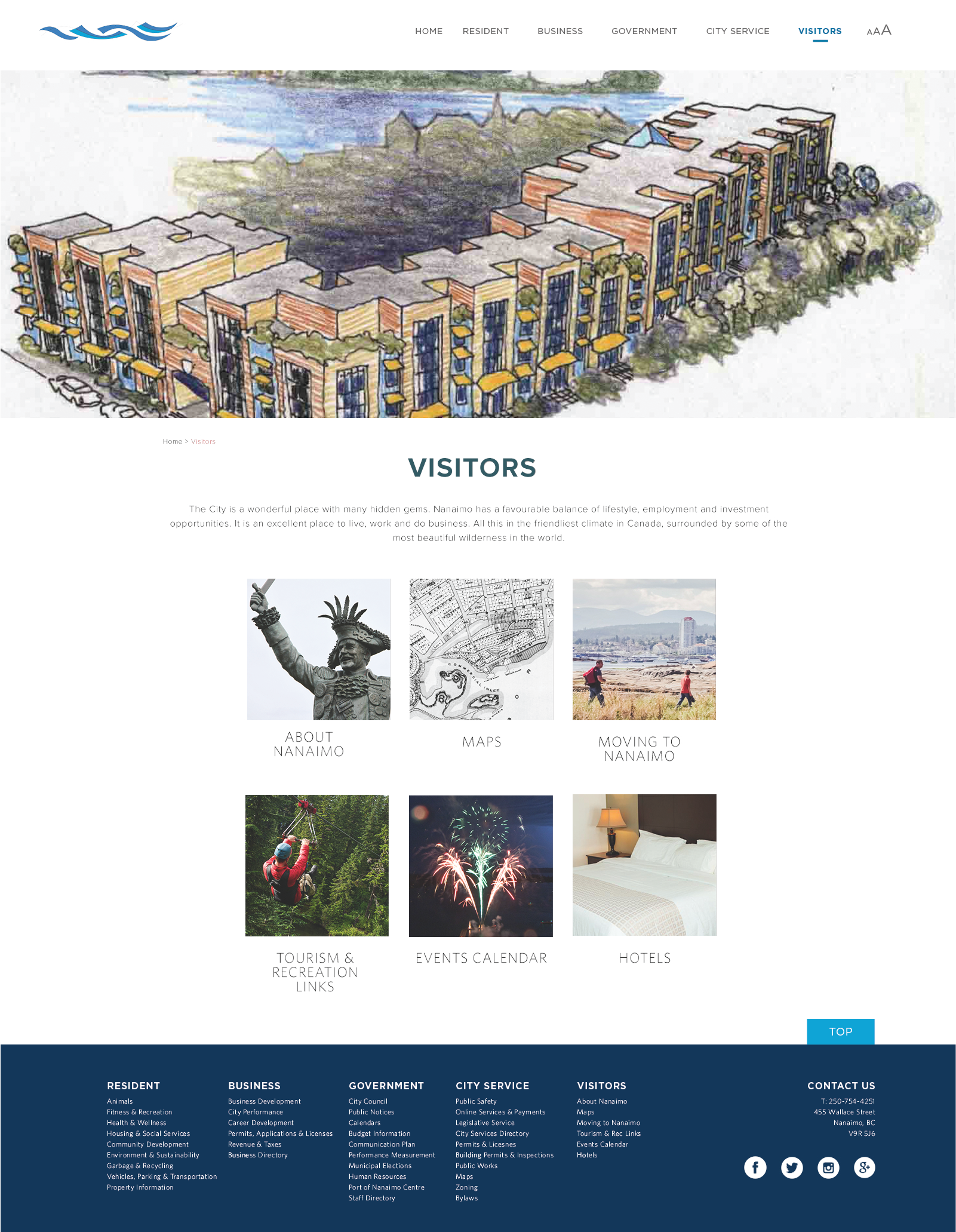
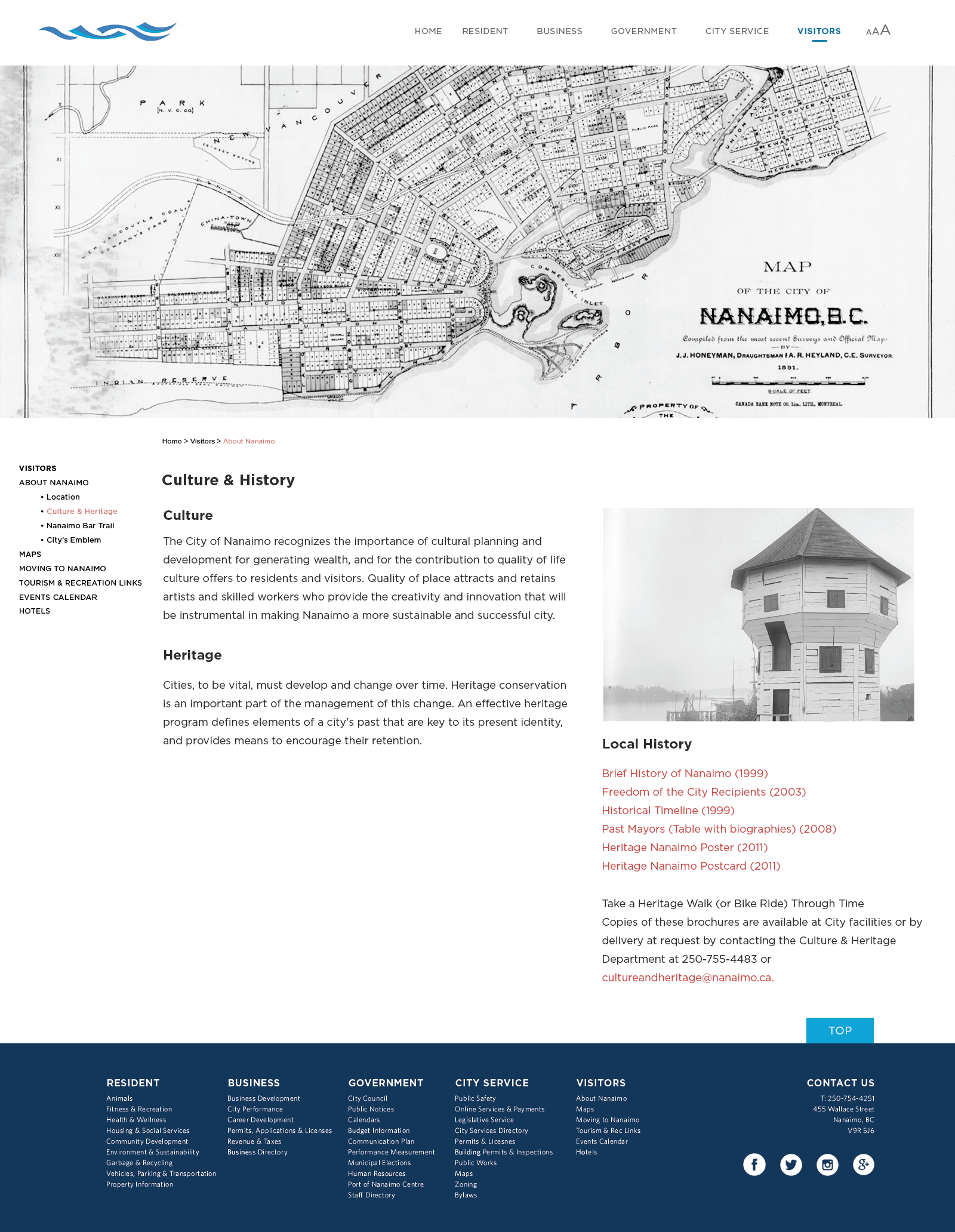
ROLE: This was a student project where we worked in pairs of two to redesign local websites. Both my and my partner created our own wireframes, then made a third set combing the two of ours together. We also re-categorized all the links on the original website to conscience information and make it more accessible. Well, my partner created a photoshop template, I filled out each page with the content. Then exported each page as a PDF. By using InVision I then created an interactive mock-up where my partner then ran some user tests to test out the practicality of our redesign.
PRODUCTION TOOLS AND SOFTWARE: Pencil and Paper, Photoshop, Acrobat, InVision
Student Project
OBJECTIVE: This is a website re-design of the City of Nanaimo. This was a group project of two for Interface Design. We learned about UX/UI design and its importance. The task at hand was to find a website that was poorly designed and redesign it to be more user-friendly.
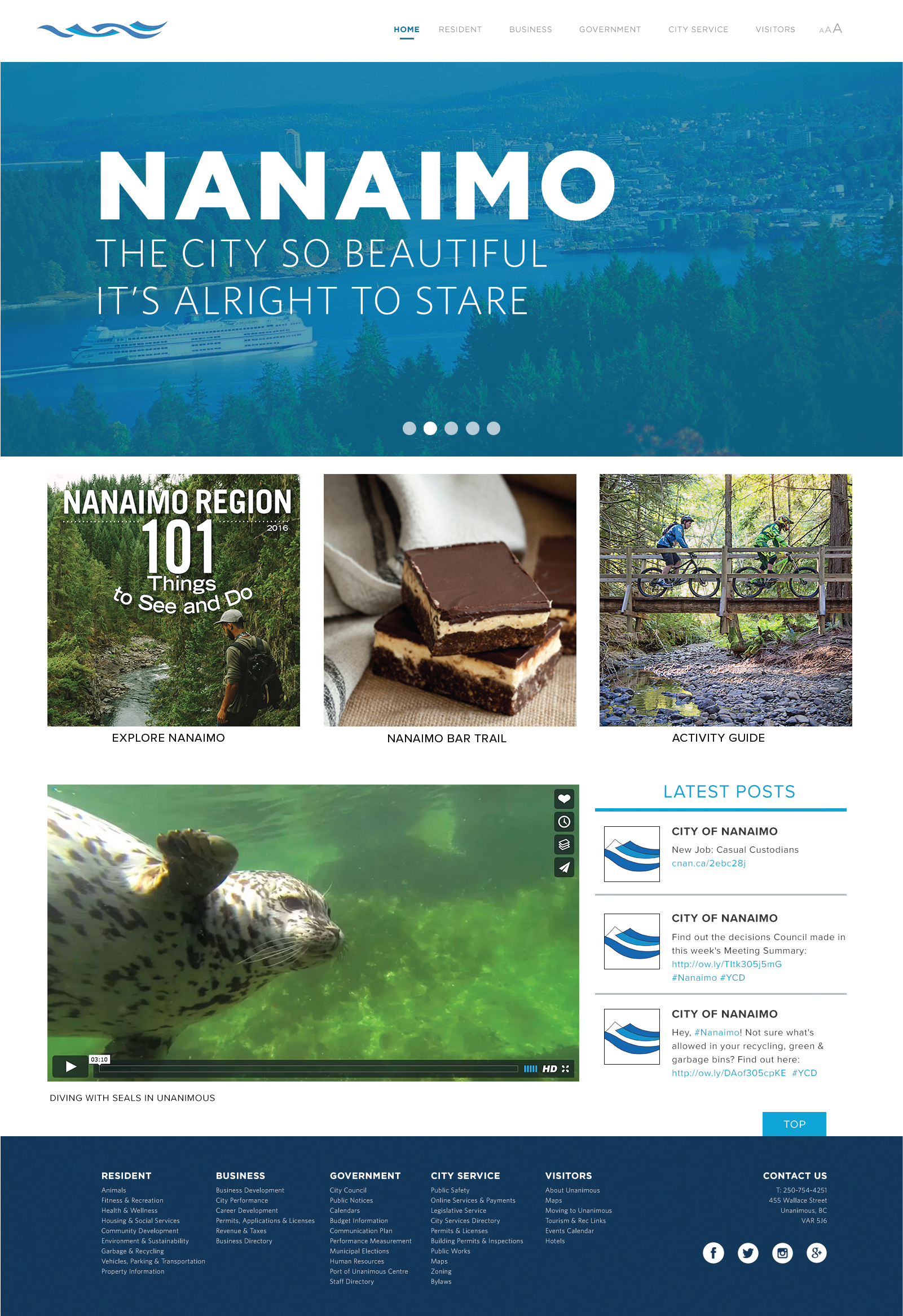
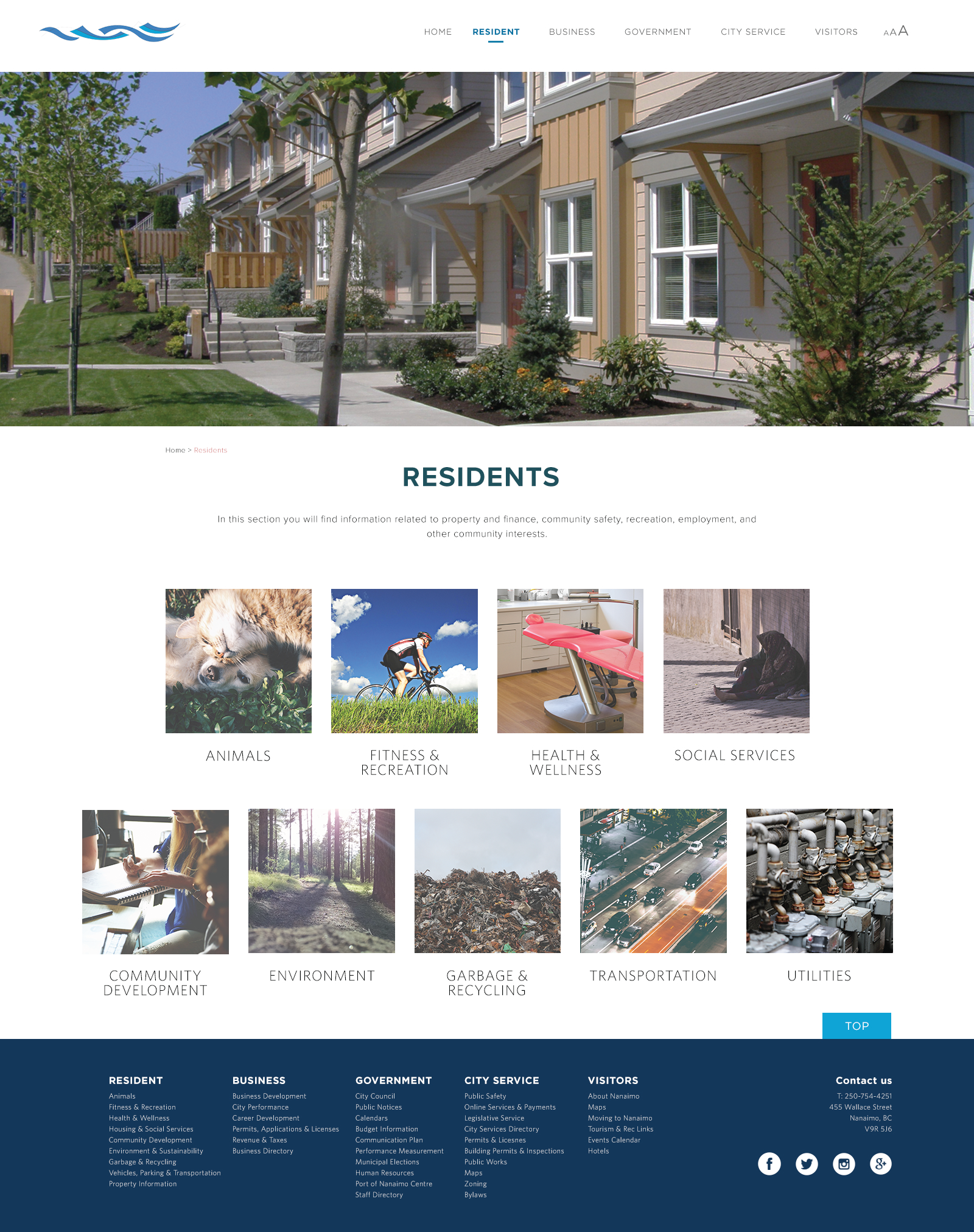
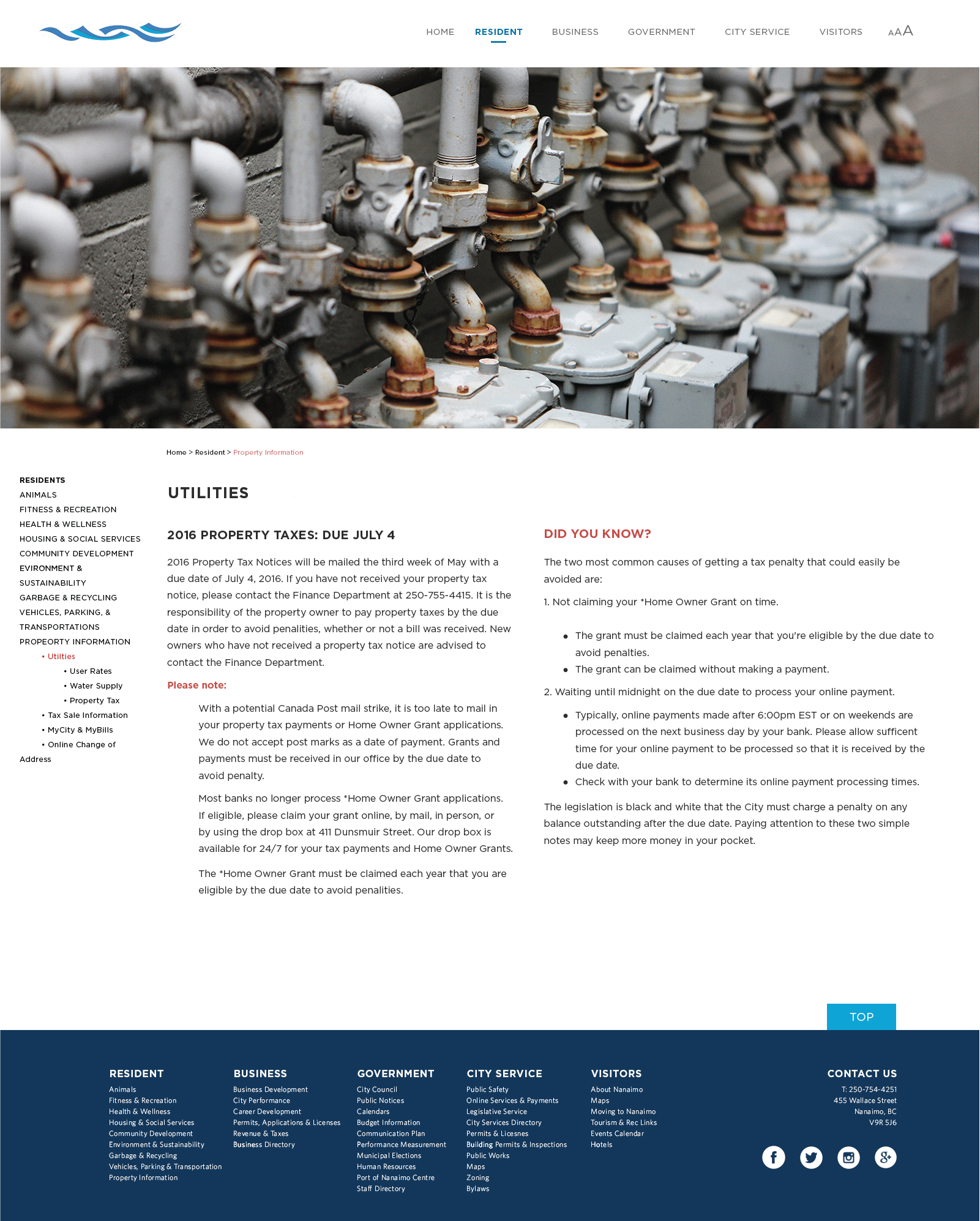
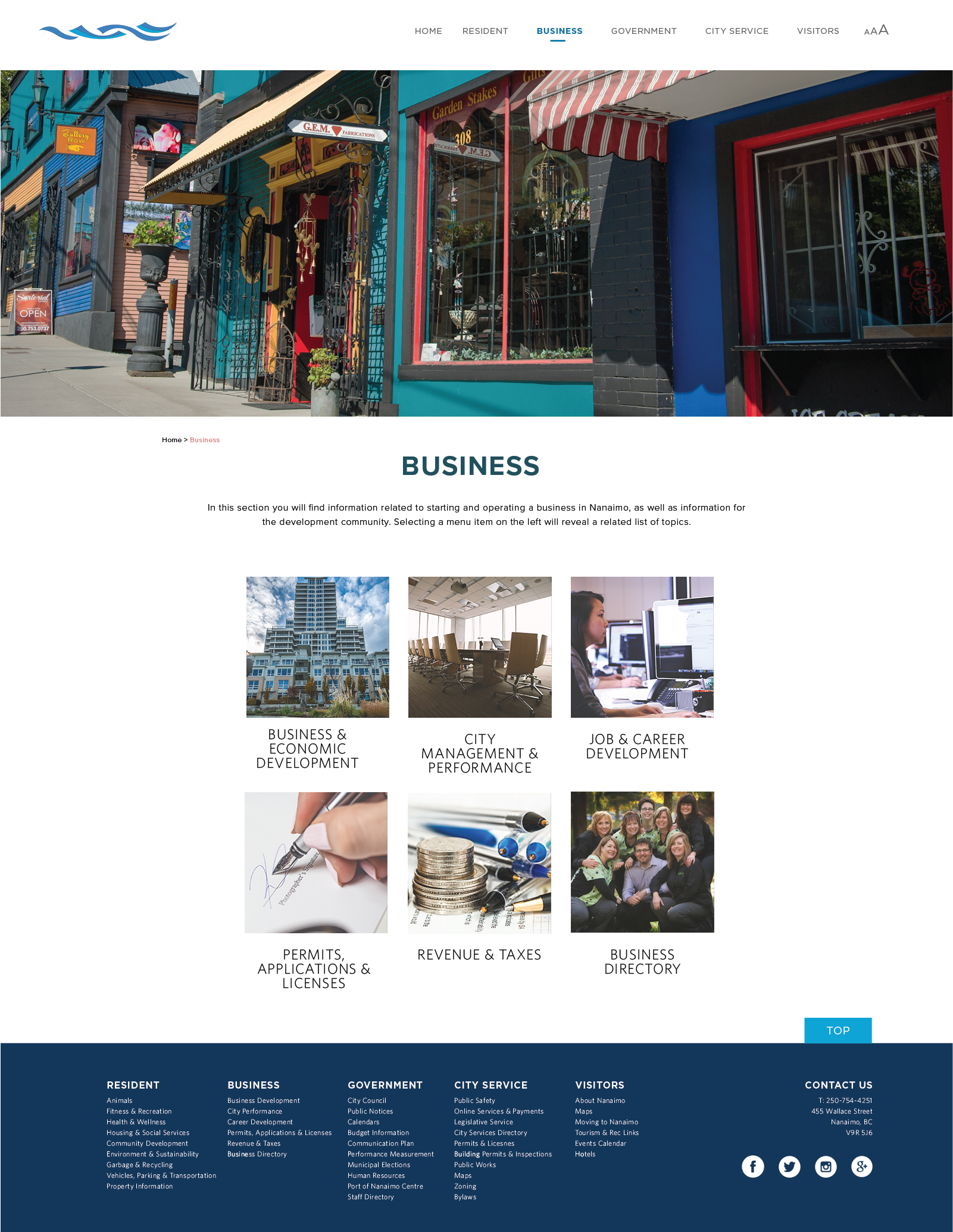
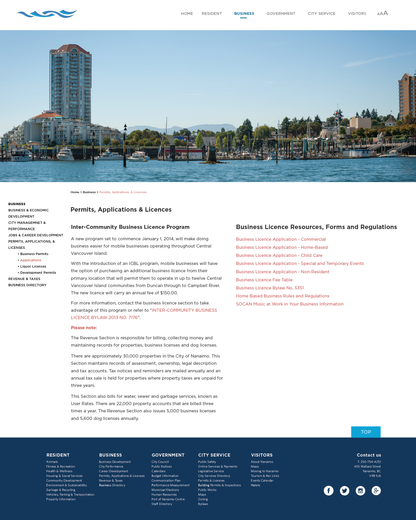
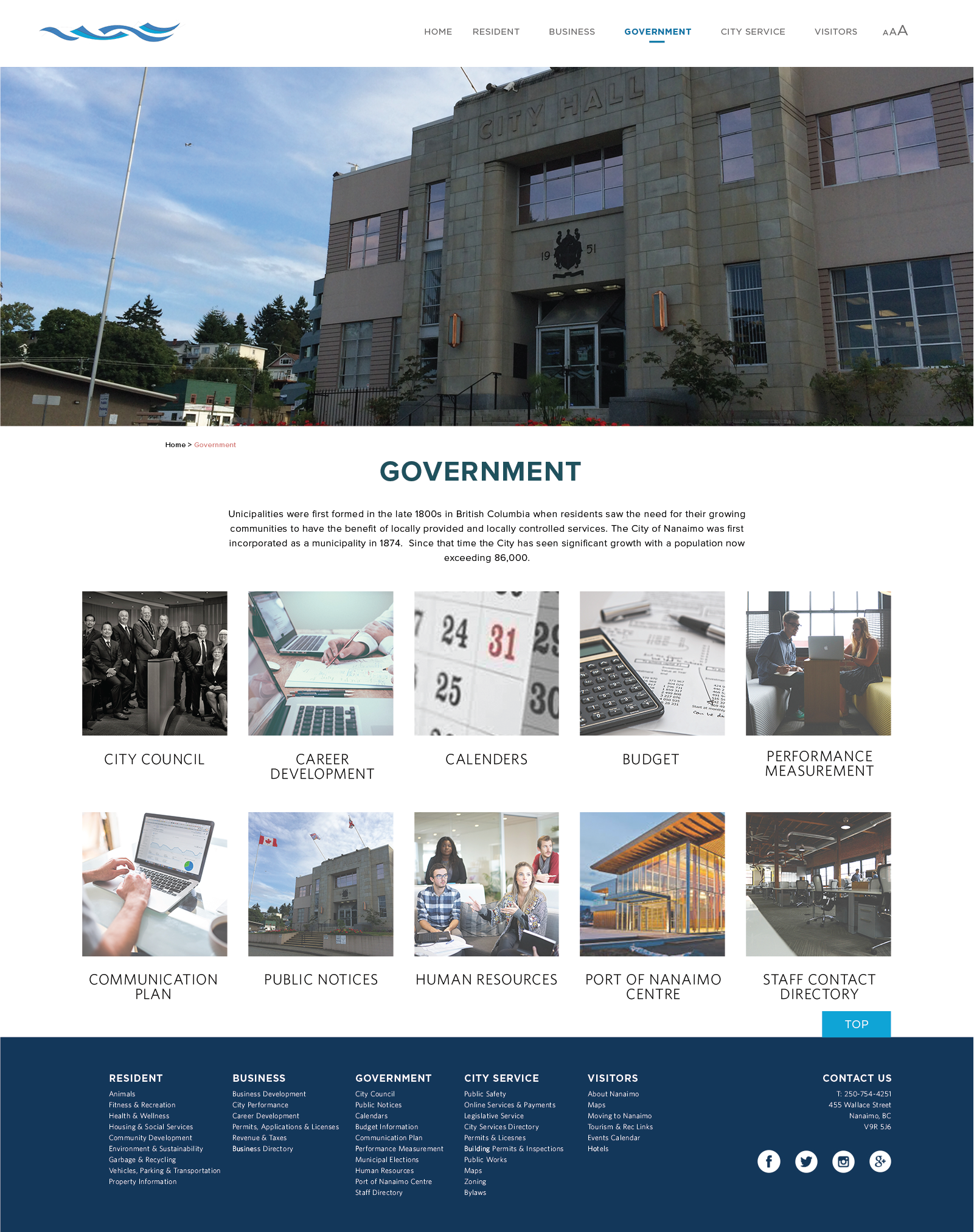
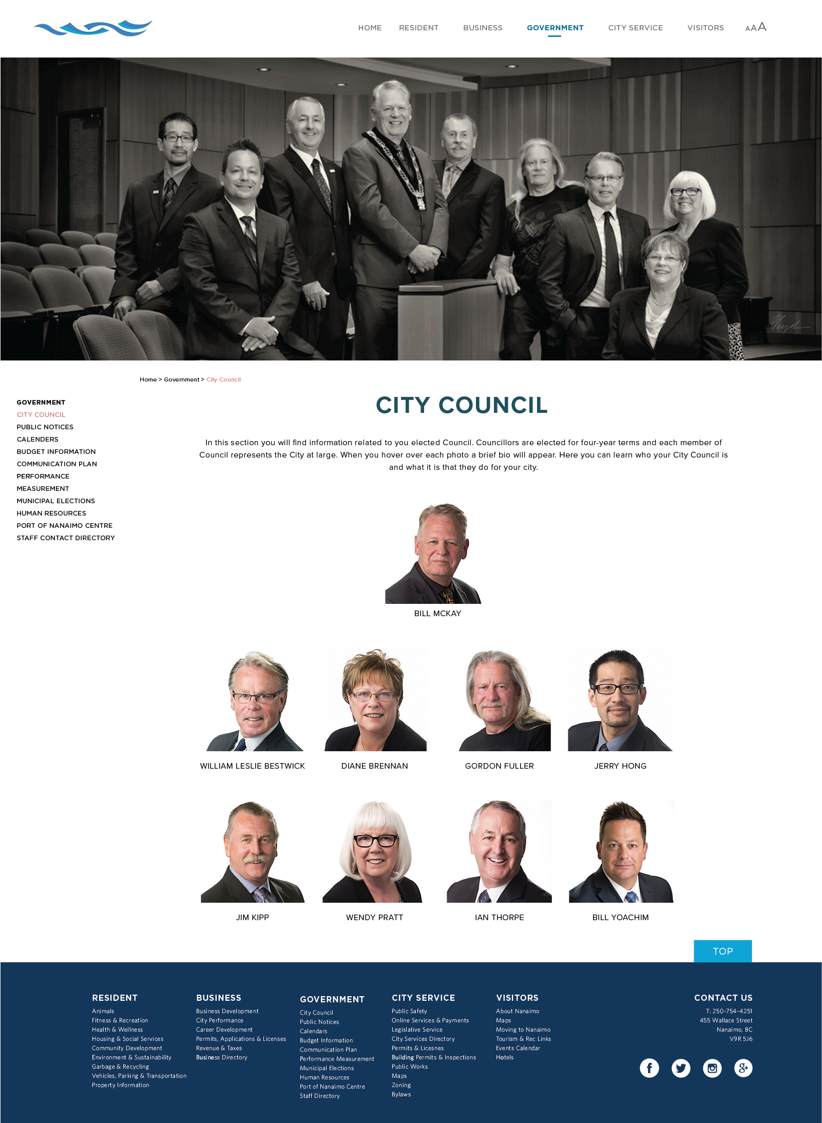
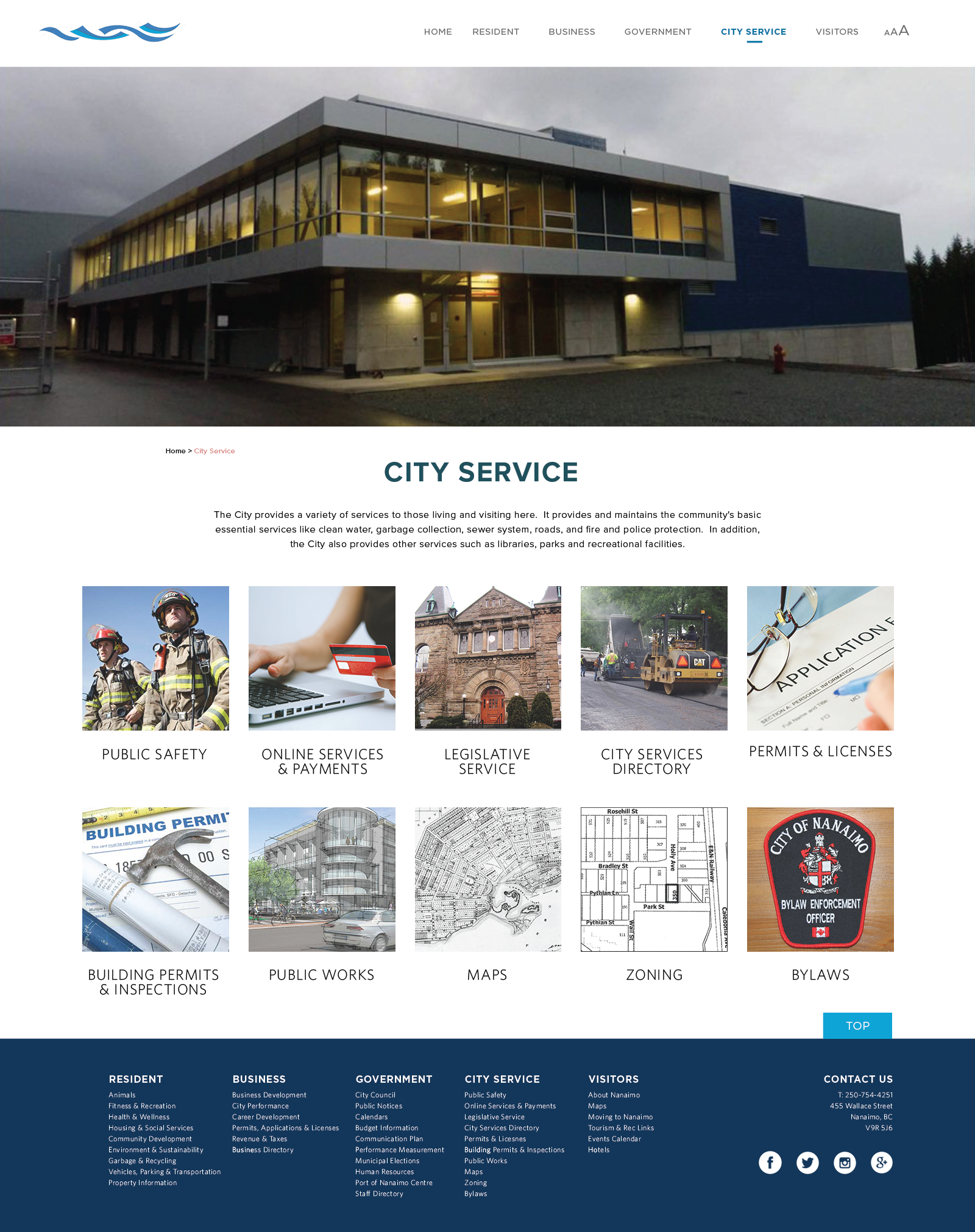
PROCESS: My partner and I picked the City of Nanaimo. We recategorized the content and updated the look and feel. Well keeping true to the Nanaimo branded colour pallet, we also chose to add in a soft coral colour to add a spark of life. This can be seen in the crumb trail, links, and other important information. Our starting point was breaking down all the information that the City Of Nanaimo already had on their website, and reorganize the content.
The gallery directly below is a screenshot from October 3, 2016. This screenshot captures what the City of Nanaimo’s website looked like at the time.
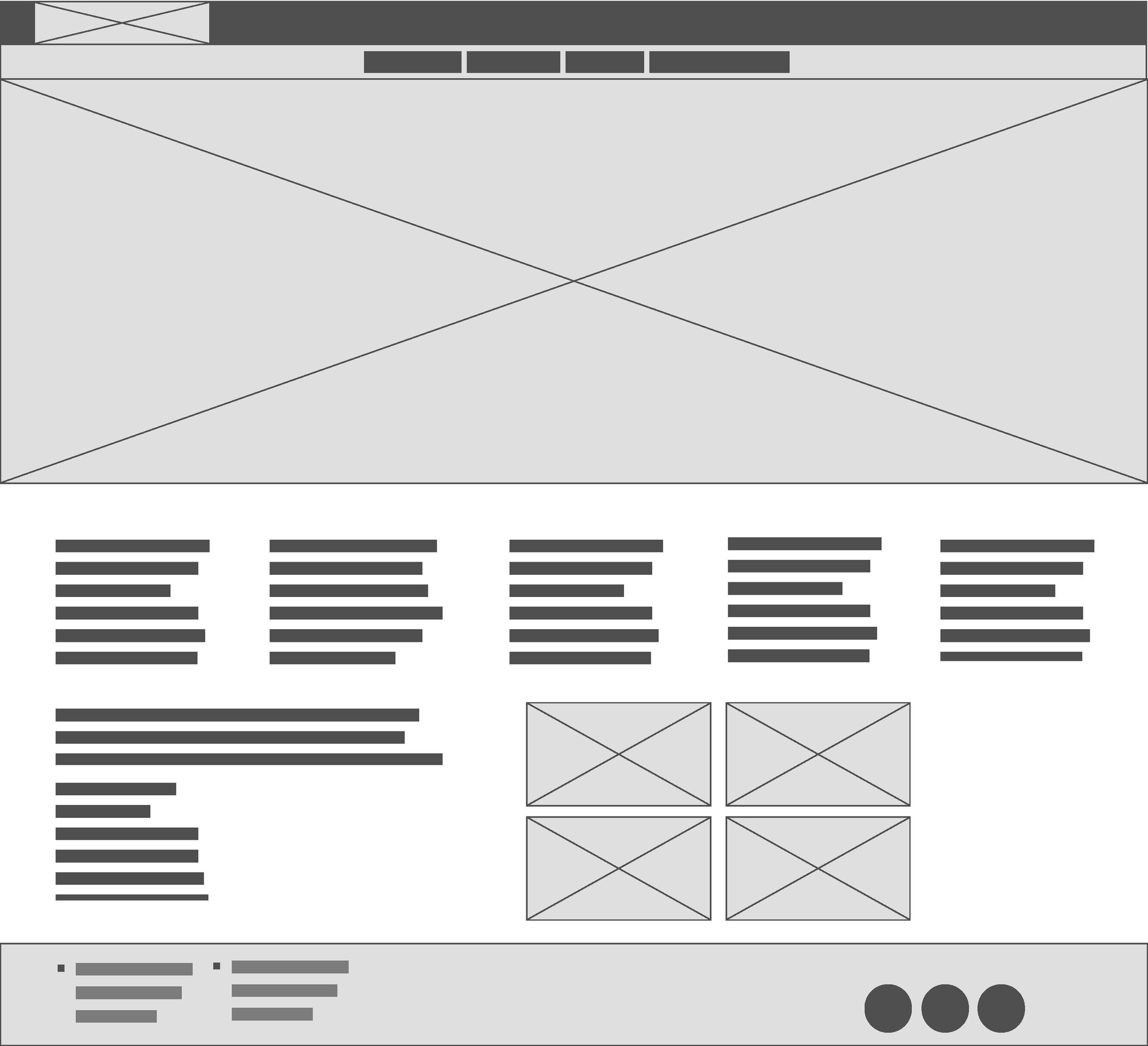
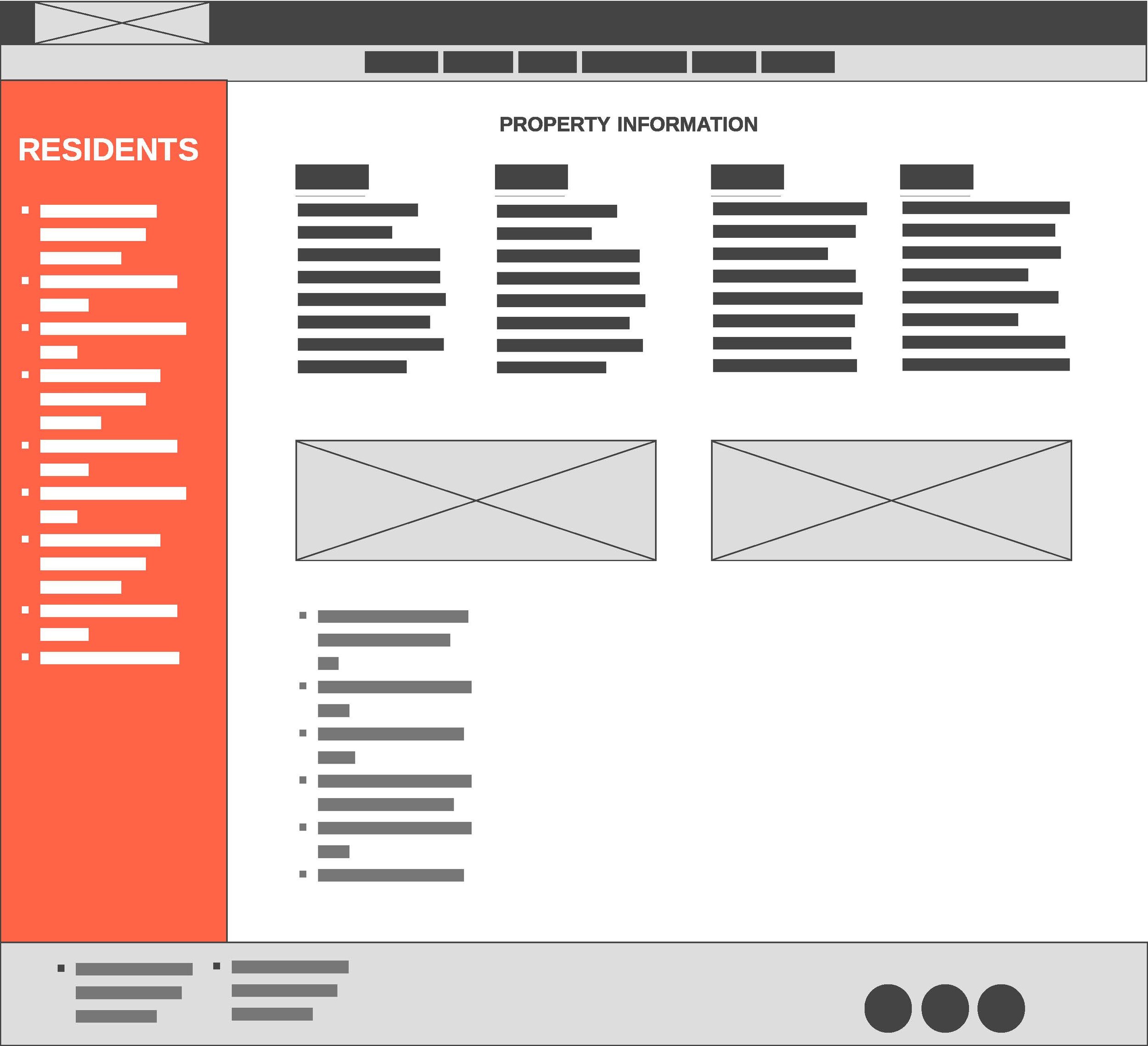
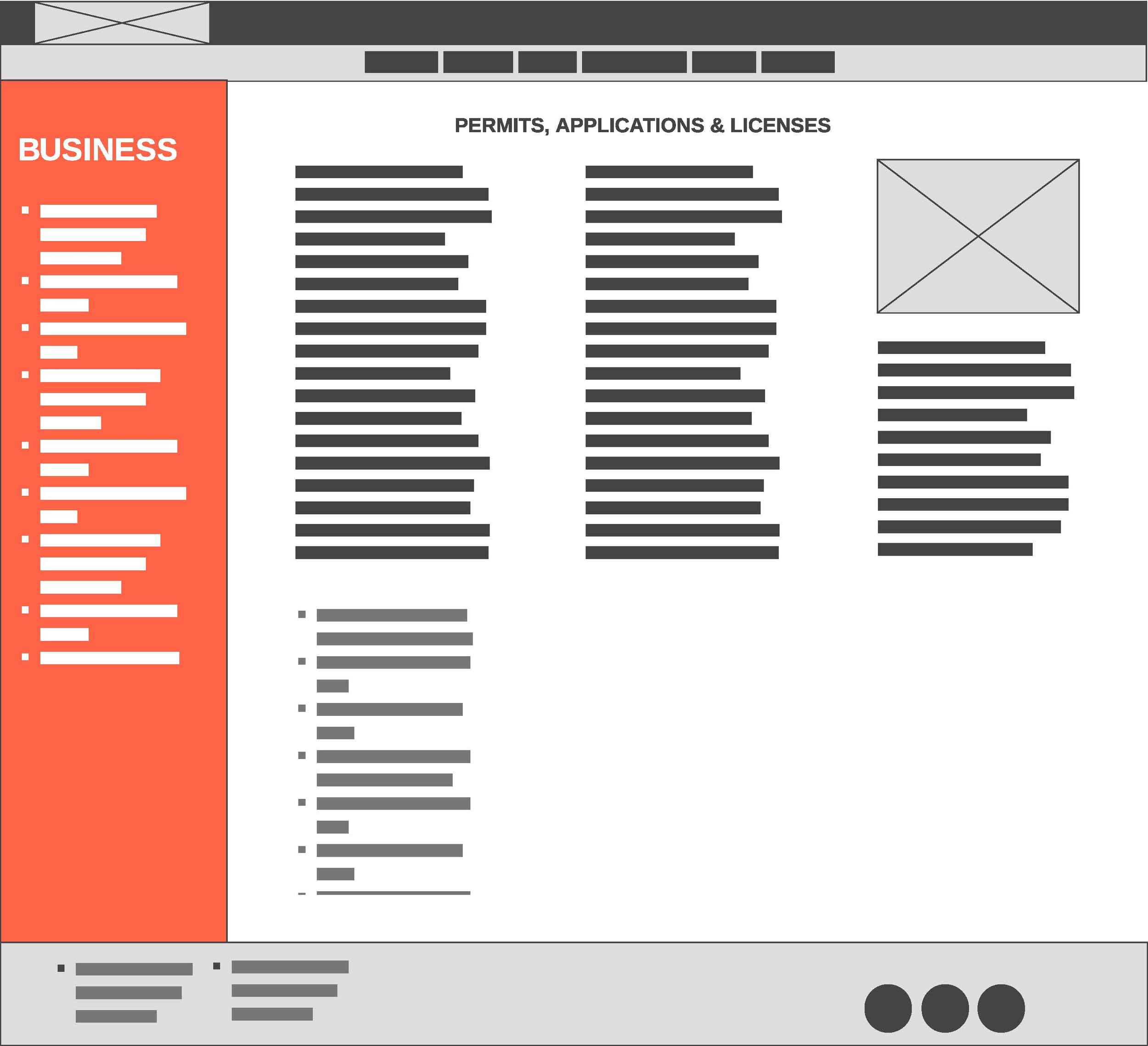
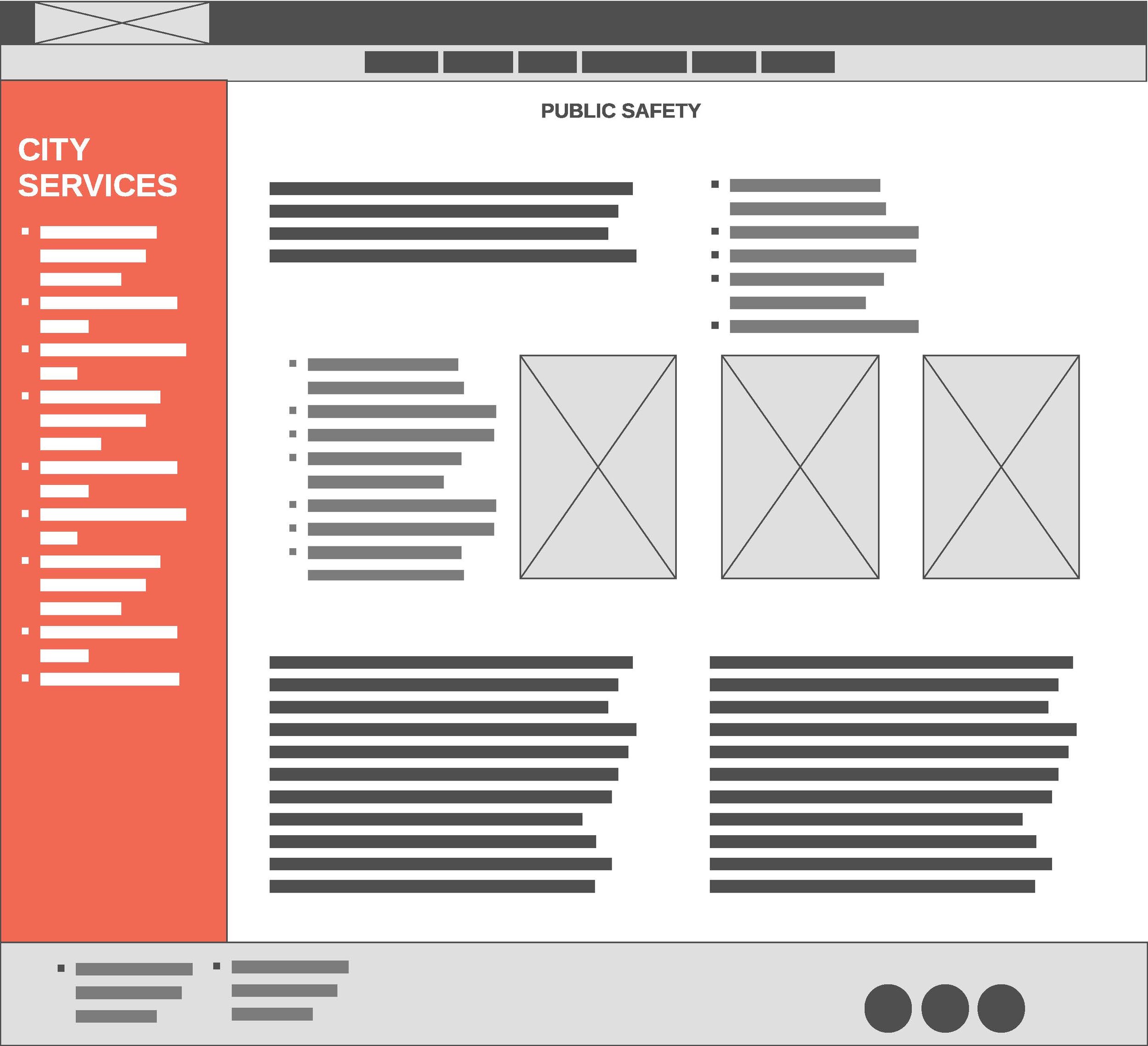
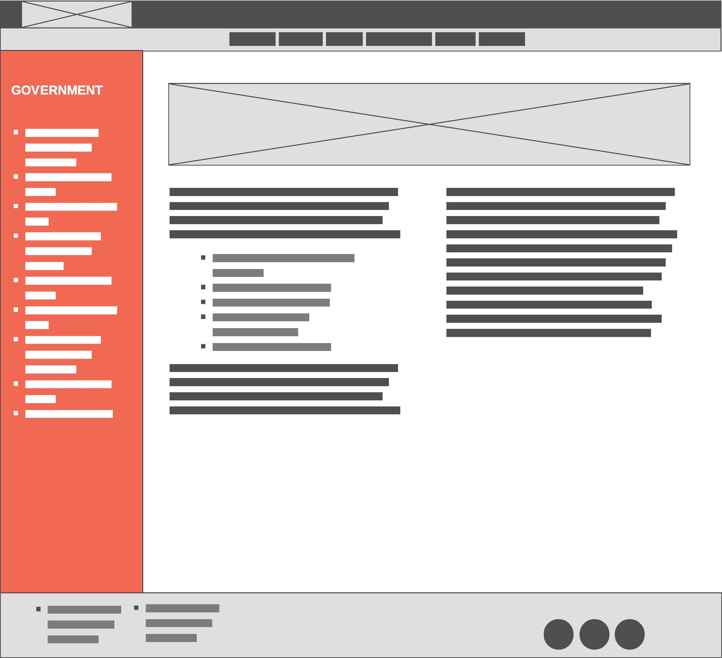
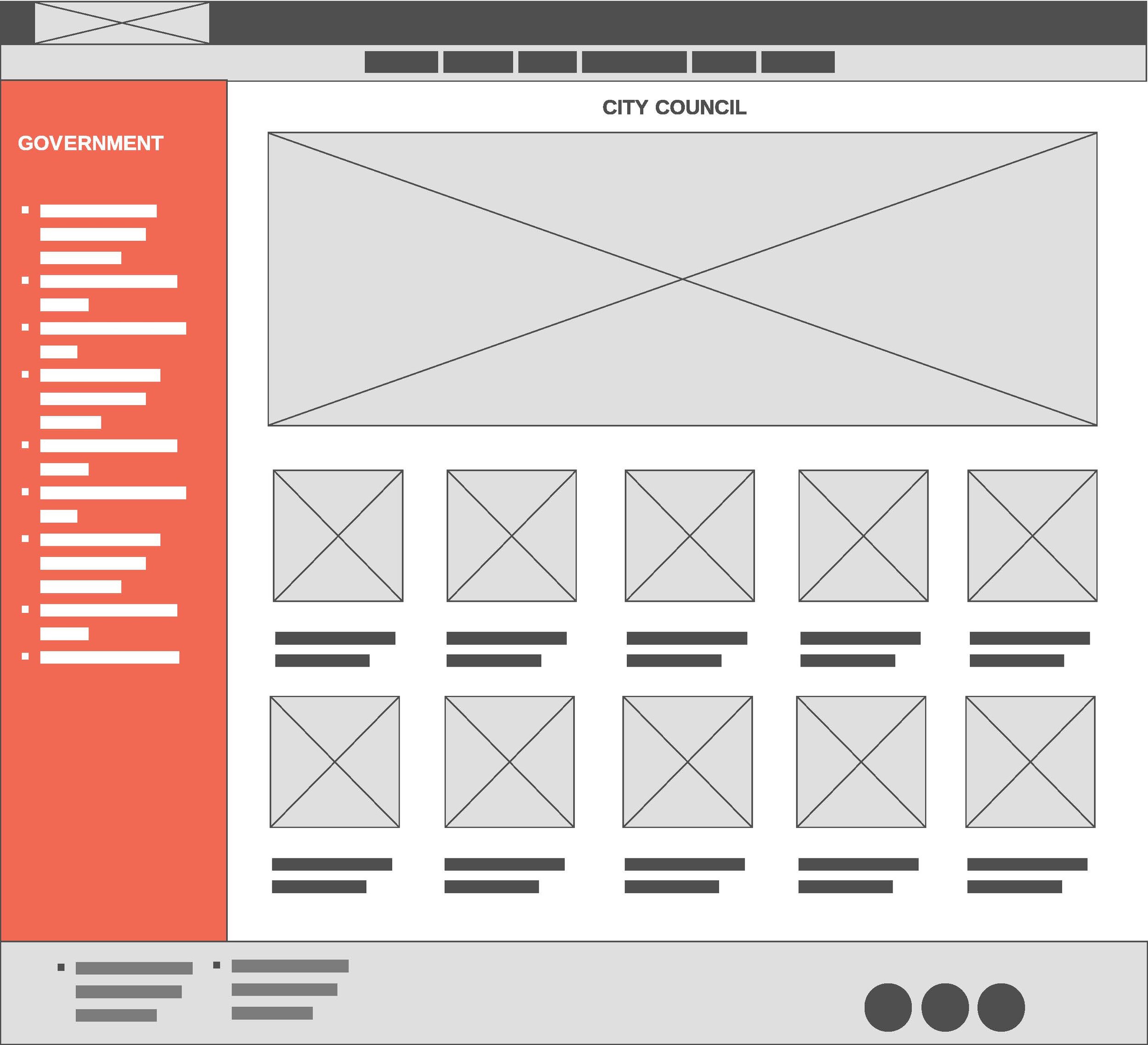
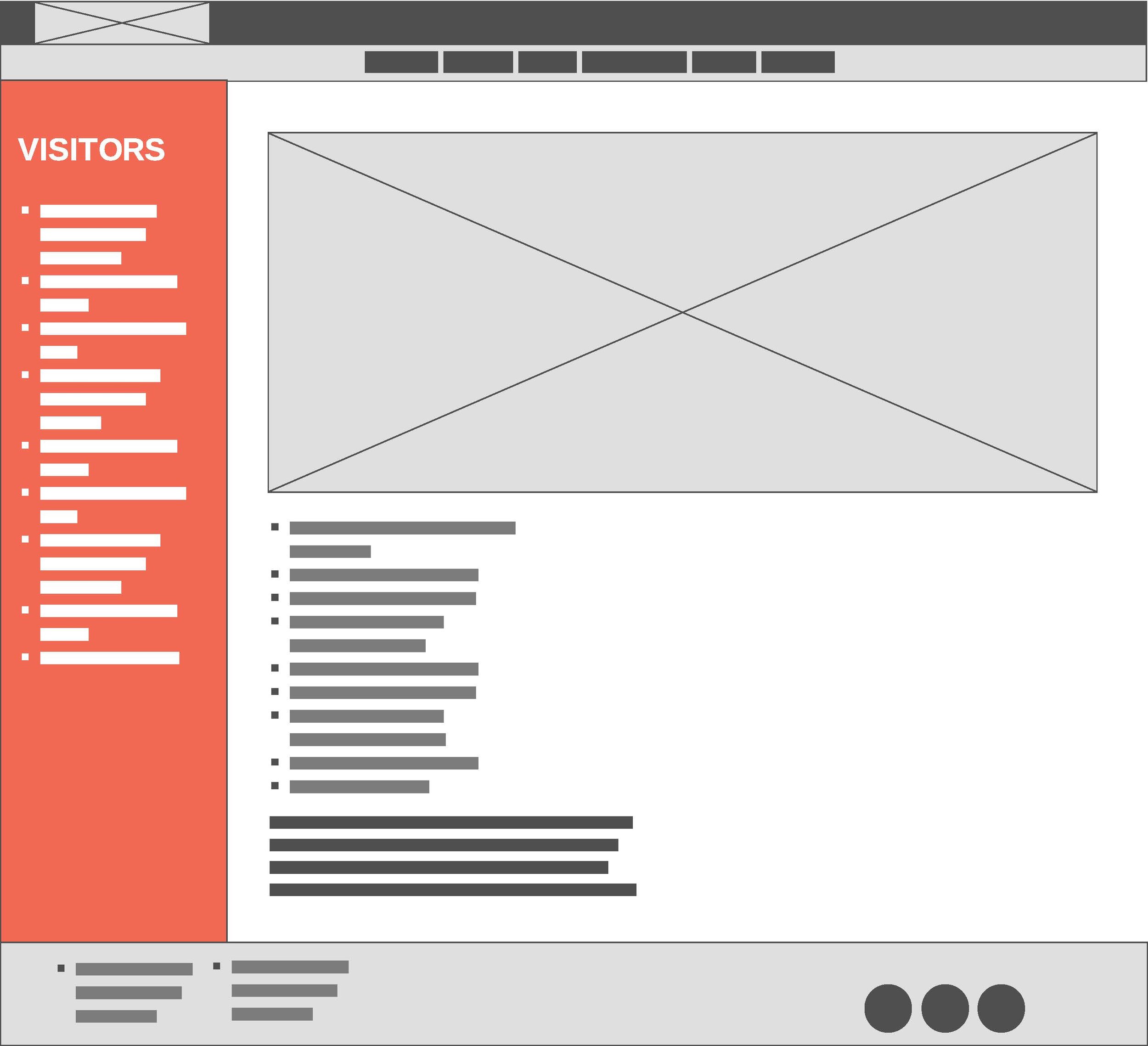
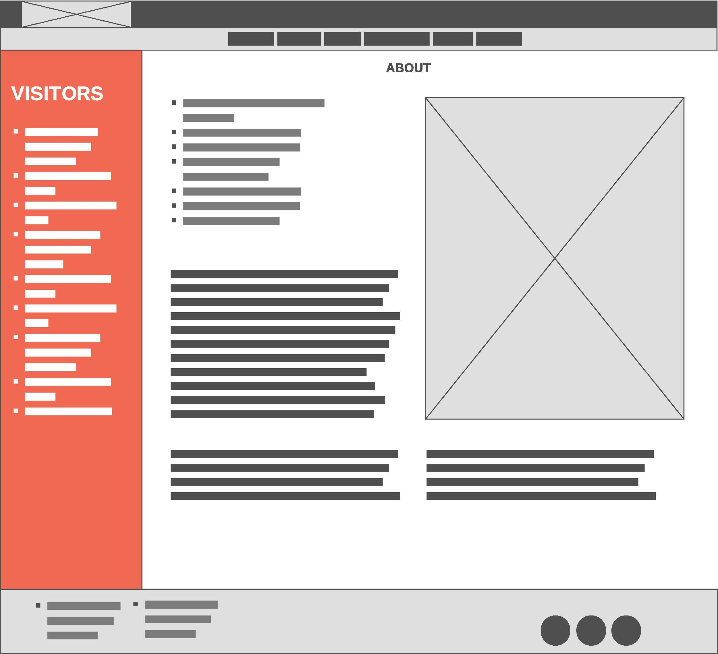
Sample wireframes for design.
Finished UX/UI outcome for project.


