OASIS CLEAN
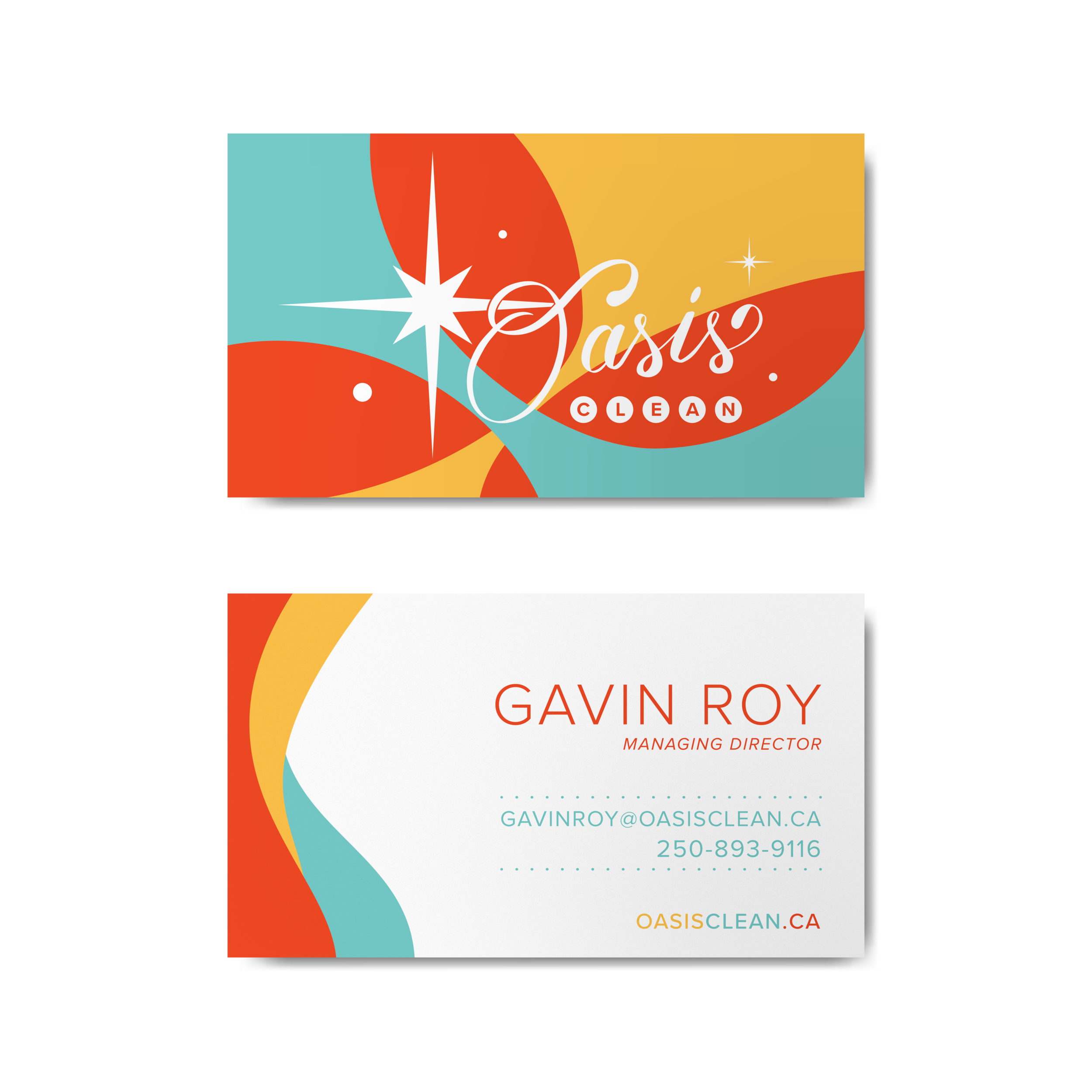
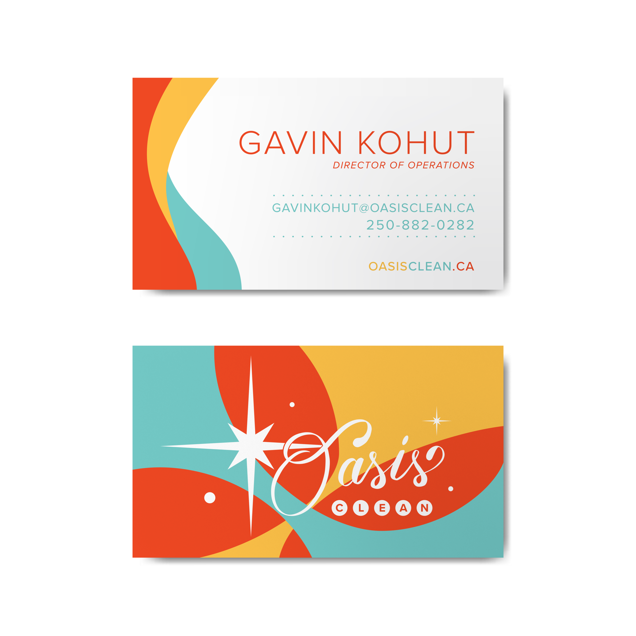
ROLE: I was the sole contributor for this project. This was contract work from Bone Creative. Shon, from Bone Creative acted as a middle man for communication when I was unable to meet/connect with the client (Oasis Clean). All aspects of the design and production were left to my responsibility.
CHALLENGE: While working on this project one challenge I faced was only meeting with one of two business owners due to scheduling issues. Both business partners had equal say in the direction. Only being able to connect with one of them did slow the process down a bit as I had to wait on feedback from the other partner. But this did also had benefits, as I had one person to communicate with so nothing got lost or miscommunicated, providing clear direction.
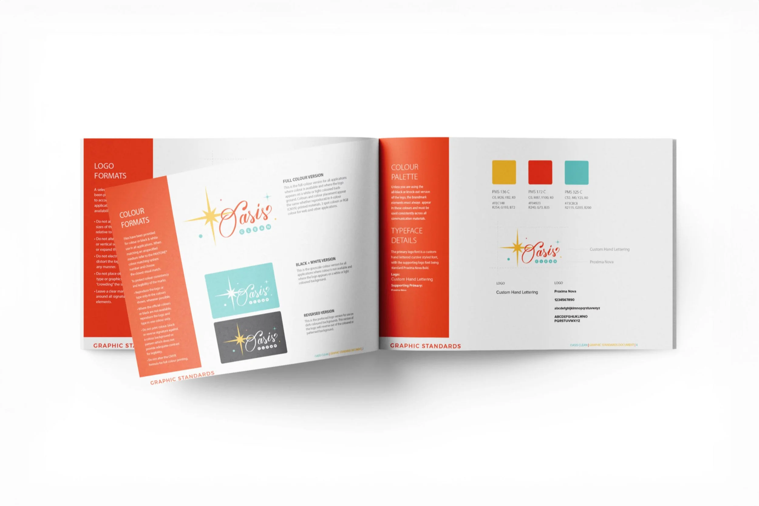
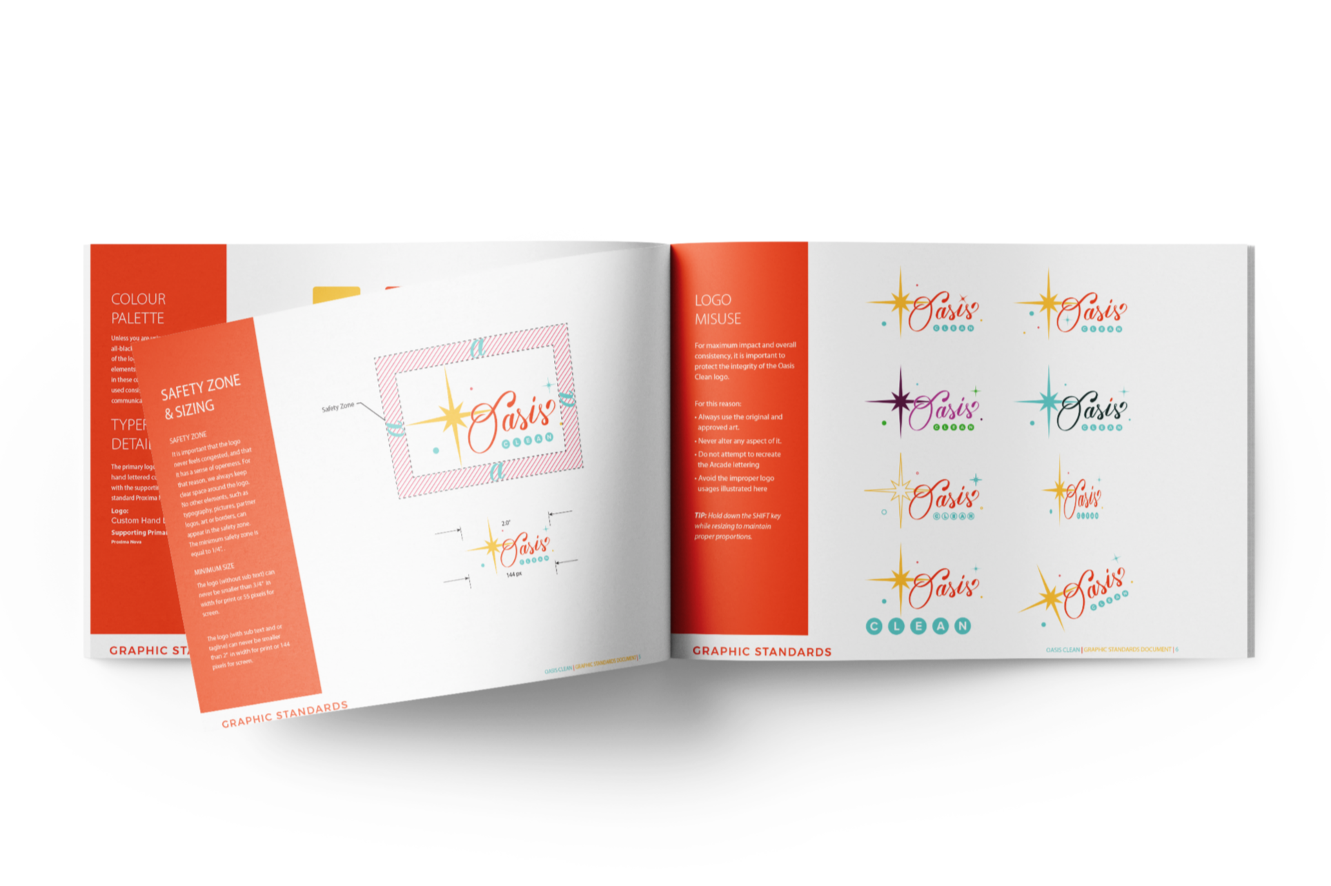
PROCESS: This project took place over 8 weeks, with 3 different phases. The first phase was research, where I looked at existing brands, sourced out inspiration to create mood boards for type, colour, and general aesthetic. The second phase was ideation, creating quick rough sketches for a logo, followed by digital roughs and ironing out the details. The third phase was putting everything together. When wrapping this project up, I provided the client with a logo package with logo variations ready for both print and web use, full colour, black and white, and greyscale., as well as a brand guideline. To ensure the best usage of their brand.


